
Overview
Data engineering runs on benchmark discourse. Every vendor — us included — publishes TPC-DS numbers, and they’re useful for comparing engines under controlled conditions. But TPC-DS is not your workload, and engineers know it. The question that actually decides anything is: “what would the performance be on my exact workloads?” Answering it for one or two jobs is an afternoon in the Spark UI. Answering it for hundreds of jobs, in aggregate, is the part nobody has tooling for.
There’s a second gap benchmarks leave open: TPC-DS mostly exercises the E — raw scan and transform performance. Real pipelines ETL differently. They spend their compute across extract, transform, and load in proportions that vary wildly by job — and that split determines everything: where your money goes, which fixes are worth making, and what an engine change would actually buy you. To reason about any of it, you need a tool that breaks down how much time each Spark job spends in each phase, classifies every stage, and shows exactly how your compute is being burned.
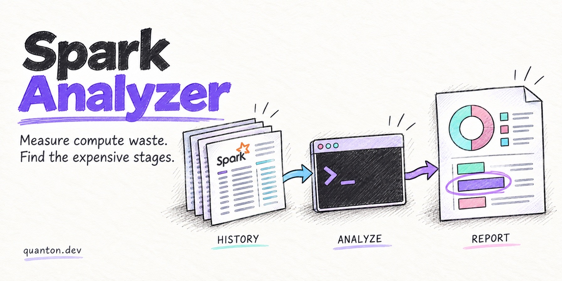
Spark Analyzer is that tool: a free CLI from Onehouse that reads your Spark History Server and answers, per application, how much of the compute you allocated did useful work, how much sat idle, which stages consumed it, and what kind of work — extract, transform, load — each stage was doing. In Onehouse’s analyses across organizations, 30–70% of Spark compute is typically wasted; the tool tells you where your jobs sit. Every section of our Spark performance tuning guide ends the same way — measure it — and this is the fastest free way to do that.
Rather than describe it in the abstract, we built four deliberately broken Spark jobs — one per failure pattern from the tuning guide — ran them on a local Spark 4.2 standalone cluster (4 executors × 2 cores), and pointed Spark Analyzer at the History Server. Everything below is real output.
How do I run Spark Analyzer?
Three commands — install, point at your History Server, analyze:
pip install spark-analyzer
spark-analyzer configure          # wizard: History Server URL, platform
spark-analyzer analyze --save-local
--save-local writes the analysis as JSON on your machine — nothing is uploaded anywhere. The report step turns a JSON into a three-sheet Excel workbook:
spark-analyzer report --input spark_analysis_output/spark_analysis_<app>.jsonIt works against open-source Spark, EMR, Databricks, Dataproc, and Fabric History Servers (--platform sets the baseline). One practical note from our run: you need real executors. Apps run with master("local[*]") report no executor metrics, so utilization comes back empty. Any actual cluster — YARN, Kubernetes, standalone, even a single-machine standalone like ours — works fine.
What we ran: four jobs, four failure patterns
Each job reproduces one pattern from the tuning guide, on the same 8-core standalone cluster:
| Application | Deliberate problem | Wall-clock | Compute used | Resource efficiency | Compute waste |
|---|---|---|---|---|---|
orders-enrichment-daily | Data skew: one customer = 35% of 150M rows | 1.12 min | 5.03 core-min | 59.2% | 40.8% |
sessionization-hourly | Spill: global sort bigger than executor memory | 1.32 min | 7.89 core-min | 79.8% | 20.2% |
feature-join-backfill | Shuffle-heavy 80M × 80M join | 0.48 min | 3.37 core-min | 90.0% | 10.0% |
events-ingest-compaction-candidate | Small files: 2,400 tiny parquet files | 0.80 min | 5.34 core-min | 99.3% | 0.7% |
Two things worth reading out of that table before we zoom in:
- Skew shows up as waste. A straggler doesn’t keep the cluster busy — it keeps one core busy while the rest idle at a stage barrier. The analyzer prices that directly: 40.8% of everything we allocated to the skewed job did nothing.
- High efficiency is not innocence. The spill and shuffle jobs score 80–90% “efficient” because their cores were genuinely busy — busy serializing spill files and moving bytes. Efficiency tells you whether you’re paying for idle metal; the stage-level sheet tells you whether the busy work was useful. You need both.
Reading the skew report
The application summary for orders-enrichment-daily says the quiet part in one row each:
Application Duration        1.12 minutes
Total Compute Minutes Used  5.03
Resource Efficiency         59.2%
Compute Waste               40.8% of allocated resources
Longest stage               Stage 0 (0.54 mins)
Most resource-intensive     Stage 4 (3.92 core-minutes)
Workflow breakdown          Transform 100.0%
The stage-level sheet classifies stages 0, 1, and 4 as TRANSFORM_TYPE_JOIN and pins 3.92 of the 5.03 core-minutes on stage 4 — the post-shuffle join+aggregate. So the analyzer’s verdict is: one join stage owns this job, and 40% of your spend idles around it. That’s the “which stage, and how much” answer that usually takes an afternoon of Spark UI archaeology.
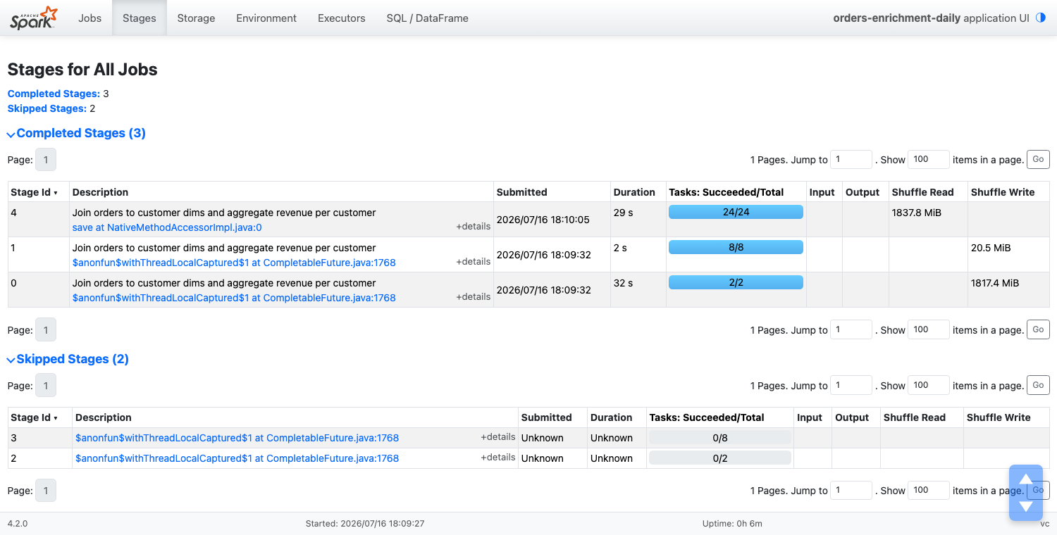
From there, the Spark UI confirms why in one screen. Here’s the same application’s stage list — stage 4 reads 1,837.8 MiB of shuffle across 24 tasks:
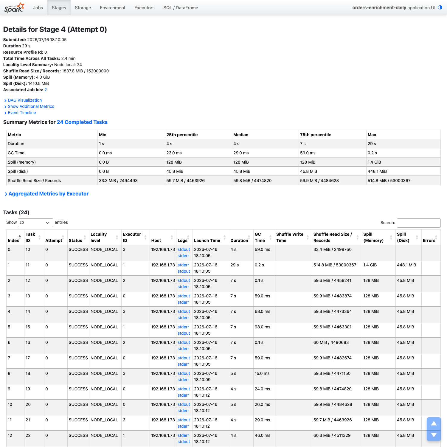
And stage 4’s detail page shows the classic skew fingerprint we described in the data skew deep dive: median task 4s, max 29s; median shuffle read 59.8 MiB, max 514.8 MiB. One task read 53 million of the stage’s 152 million records — our designed 35% hot key, found exactly:
What the E/T/L classification catches
The small-files job is the interesting one. Its efficiency looks saintly — 99.3% — but the workflow sheet reveals what all that busy compute was doing:
| Workflow type | Stages | Compute minutes | Share of job |
|---|---|---|---|
| Extract | 2 | 0.41 | 7.9% |
| Transform | 2 | 0.53 | 10.3% |
| Load | 1 | 4.40 | 81.8% |
82% of the job is writing files. Nothing is “wasted” in the idle-cores sense — the job is simply spending five-sixths of its compute producing 2,400 tiny files that will make every downstream query slower. This is the exact profile one Spark Analyzer user found in production: with 60%+ of job time going to file writes, they reworked table layout and parallelism and got 40% faster jobs at 38% lower cost — no engine change. (If small files are your profile, clustering and compaction is the follow-up read.)
That classification is also what feeds the report’s Quanton projection: each stage type gets an expected acceleration range based on how Quanton’s engine handles that work (native scans for extract, vectorized operators for transform, native lakehouse writes for load). Our skewed join job projects 67–75% runtime reduction. And the projections are honest in the other direction too — for the toy small-files job, whose plain-parquet write Quanton has no special path for, the report says “similar performance” rather than inventing a win. In one real EMR migration, the analyzer predicted 27% acceleration; actual Quanton results significantly outperformed the estimate.
Where Spark Analyzer fits
| Question | Tool |
|---|---|
| Is this job wasting the compute I allocate to it? Which stage? What kind of work? | Spark Analyzer — offline, fleet-wide, free |
| Why is this specific stage slow right now, and what’s the fix? | Quanton AI agent in the Spark UI — live diagnosis of skew, shuffle, OOM risk, and partition issues, with recommended config/code fixes |
| Task-level forensics on a single run | Spark UI / History Server |
Spark Analyzer is the survey instrument: run it across your History Server, rank applications by compute waste, and you have a data-driven backlog instead of a hunch. The per-GiB math for what those jobs would cost on Quanton is on the pricing page.
Takeaway
You can’t fix what you haven’t measured, and measuring used to mean event-log archaeology. Three commands now get you a per-application answer: our deliberately skewed job was wasting 40.8% of its allocated compute, our small-files job was spending 81.8% of its compute writing files, and the report named the stage responsible in both cases. It’s free, it runs locally, and your data stays put with --save-local.
pip install spark-analyzerRun it against your History Server — then come back to the tuning guide with a ranked list of jobs worth fixing.
